What a 3D Design Icon Brings to Modern Interfaces
When you scan a website or app, icons do much of the heavy lifting. They guide your eye, signal actions, and set the visual tone. Among the many icon styles available today, the 3D design icon stands out for its depth, realism, and ability to create a memorable impression. But it is not always the right choice. Understanding what makes a 3D design icon distinct, where it excels, and when to opt for a simpler alternative helps you make better design decisions—whether you are building a brand, developing an interface, or choosing assets for a project.
What Defines a 3D Design Icon
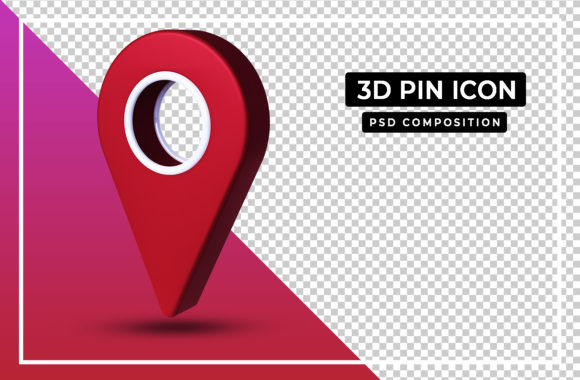
At its core, a 3D design icon is an icon rendered with three-dimensional qualities—shading, lighting, perspective, and often texture. Unlike flat icons that rely on shape and colour alone, a 3D design icon simulates volume. It may look glossy, matte, metallic, or soft, depending on the intended effect. The extra dimension gives it a tactile, almost physical presence that can make a button, app icon, or illustration feel more engaging.
What makes a 3D design icon distinct from other styles is its emphasis on realism or stylised depth. Even a minimalist 3D icon—one with simple geometry and soft shadows—carries a sense of weight and space that a flat icon cannot replicate. This quality is especially useful when you want an element to stand out or when the user should feel invited to tap, click, or explore.
Comparing 3D Design Icons with Other Icon Styles
To decide whether a 3D design icon fits your project, it helps to see how it stacks up against common alternatives. Keep in mind that no single style is universally superior. Each has strengths suited to specific contexts.
Flat Icons
Flat icons have dominated digital design for years. They use clean lines, solid colours, and no shading. Their strength is speed: they load fast, scale cleanly at any size, and work well in high-density navigation menus. A flat icon is also highly accessible when paired with proper colour contrast.
In contrast, a 3D design icon adds visual interest but can introduce complexity. If your interface relies on many small icons, a 3D style may create visual clutter. Flat icons remain the pragmatic choice for data-heavy dashboards, administrative panels, or any interface where clarity and rapid scanning matter more than visual flair.
Outline and Line Icons
Outline icons are minimal by nature—thin strokes, no fill, little to no depth. They are excellent for toolbars, status indicators, and places where you need subtle cues. Their lightweight appearance keeps the focus on content.
A 3D design icon, by contrast, commands attention. It can serve as a focal point on a landing page or in a call-to-action. But using a 3D design icon where an outline icon would suffice risks overpowering the message. For instance, a settings gear icon is better kept simple; enhancing it with 3D effects does not improve usability and may slow recognition.
Glyph and Symbolic Icons
Glyph icons are abstract symbols—like a magnifying glass for search or a house for home. They rely on learned conventions. Adding 3D rendering to such symbols can make them feel novel, but it can also break the mental shortcut users rely on. If you choose a 3D design icon for a well-known action, test it with your audience to ensure the extra detail does not obscure meaning.
Strengths of a 3D Design Icon
When used deliberately, a 3D design icon brings benefits that simpler styles cannot match.
- Emotional impact: Depth and lighting create a sense of craftsmanship. A 3D design icon can make a brand feel more premium, playful, or innovative.
- Hierarchy and emphasis: On a page with many flat elements, a single 3D design icon naturally draws the eye. It can signal primary actions or highlight featured content.
- Real-world affordance: Icons that look three-dimensional can hint at physical interaction, like a button that appears pressable. This can improve usability in contexts like gaming, e-commerce, or educational apps.
- Brand differentiation: Many interfaces rely on flat or outline icons. A consistently applied 3D design icon set can help your product stand out in a crowded market.
Tradeoffs and Limitations
Every strength comes with a counterbalance. Being aware of these tradeoffs helps you avoid common pitfalls when using a 3D design icon.
- File size and performance: A detailed 3D design icon may be larger than its flat counterpart, especially if it includes gradients, textures, or complex shapes. On mobile or low-bandwidth connections, too many 3D icons can slow load times.
- Scalability: Flat icons scale perfectly to any size because they lack detail that might degrade. A 3D design icon often has fine shadows or highlights that can blur or become muddy at small sizes. Below 24×24 pixels, the depth may be lost entirely.
- Consistency: Maintaining a uniform style across a large set of 3D design icons requires careful lighting and perspective guidelines. It is more time-consuming than creating flat icons, which follow simpler rules.
- Accessibility: Users with visual impairments may find low-contrast shadows or glossy highlights hard to parse. If you rely on a 3D design icon to convey meaning, always pair it with text or provide high-contrast alternatives.
- Trend sensitivity: Flat design has proven remarkably durable. Highly realistic 3D icon styles can look dated faster. A moderately stylised 3D design icon—one that uses soft depth without photorealistic texturing—tends to age better.
When a 3D Design Icon Is the Right Choice
Certain use cases naturally favour a 3D design icon over flatter alternatives.
- Hero sections and landing pages: A large 3D design icon can anchor a visual and create a strong first impression. For example, a travel app might use a 3D suitcase icon with subtle shadows to evoke wanderlust.
- Apps or games with a playful tone: Children’s apps, games, or creative tools benefit from icons that feel tangible. A 3D design icon on a colour palette or a musical note can make the interface feel more interactive.
- Brand assets and app store icons: Your app icon is often the first thing a user sees. A polished 3D design icon can convey quality and uniqueness in the app store, helping your product stand out among hundreds of flat squares.
- Virtual or augmented reality: In immersive environments, icons that mirror physical depth feel more natural. A 3D design icon aligns with the spatial logic of VR/AR, whereas flat icons can break the illusion.
When You May Need a Different Approach
The same features that make a 3D design icon compelling can also work against you. Recognise these scenarios where a different icon style may serve better.
- Complex navigation systems: If your interface contains dozens of icons—like an enterprise dashboard or a settings menu—flat or outline icons keep cognitive load low. A 3D design icon in such a context adds visual noise.
- High-speed or data-limited environments: For progressive web apps targeting emerging markets or low-end devices, a 3D design icon can hurt performance. Flat SVGs are far more economical.
- When accessibility is the primary concern: Users relying on screen readers will not benefit from the visual depth. Moreover, low-contrast 3D effects can make icons harder to distinguish. In regulated industries (healthcare, finance), simplicity often wins.
- When the meaning must be instantly recognised: For universal symbols like “play,” “pause,” or “search,” users expect a familiar shape. A highly stylised 3D design icon might delay recognition, leading to friction.
Realistic Examples of Using a 3D Design Icon
Let’s look at two practical situations where the choice of icon style directly affects the user experience.
Scenario 1: An e‑commerce app for home goods. The app uses a mix of product photos and interface elements. A 3D design icon for the shopping cart, rendered with a soft highlight and a subtle shadow, makes the cart feel like a physical object. It sits well alongside product images, reinforcing the tactile theme. Navigation icons like “account” and “search,” however, remain flat to avoid clutter. This hybrid approach uses 3D design icons only where emphasis matters, preserving performance and clarity.
Scenario 2: A productivity tool for project management. Here, speed and clarity are critical. Users frequently toggle between boards, lists, and calendars. Using a 3D design icon for every function would slow rendering and create visual competition. Instead, the app uses flat outline icons for most controls but reserves a single 3D design icon for the main call-to-action button (e.g., “Create new project”). That one icon draws attention without overwhelming the layout.
Key Factors in Your Decision
When evaluating whether a 3D design icon fits your project, consider these dimensions:
- Audience expectations: A younger, trend-aware audience may respond well to 3D icons. A professional B2B audience may prefer the clarity of flat design.
- Platform consistency: iOS and Android have moved toward simpler icons over the years. A 3D design icon that mimics real materials can clash with system-wide guidelines. Check if your platform’s design language supports or discourages depth.
- Maintenance overhead: 3D design icons take more time to create and update. If your team is small or your product evolves rapidly, a flat icon library may be more sustainable.
- Tone and personality: If your brand voice is playful, premium, or creative, a 3D design icon reinforces that. If your brand values simplicity, reliability, or minimalism, a flatter style aligns better.
Making an Informed Choice
No icon style is a universal answer. The best choice depends on your specific context: what the icon communicates, where it appears, who your users are, and how it fits with the rest of your design system. A 3D design icon can add warmth, depth, and memorability when applied thoughtfully. In other situations, a simpler icon will serve your users more effectively.
Rather than committing every icon to one style, consider a balanced approach. Use 3D design icons where they create the most impact—key actions, brand elements, hero visuals—and fall back to flat or outline icons for routine navigation. This strategy gives you the best of both worlds: visual interest where it counts, and usability where it matters most.
As you explore your options, test your icons with real users. Watch how they scan, tap, and interpret each symbol. The feedback you gather will tell you far more than any style guide. Whether you ultimately choose a 3D design icon or a simpler alternative, the goal remains the same: help people navigate your interface with confidence and ease.

